Spectrum Design System
Role
Visual Designer
Collaborators
Product Teams, Engineering
Timeline
2 Years
Evolving Adobe's cross-product design system and visual language.
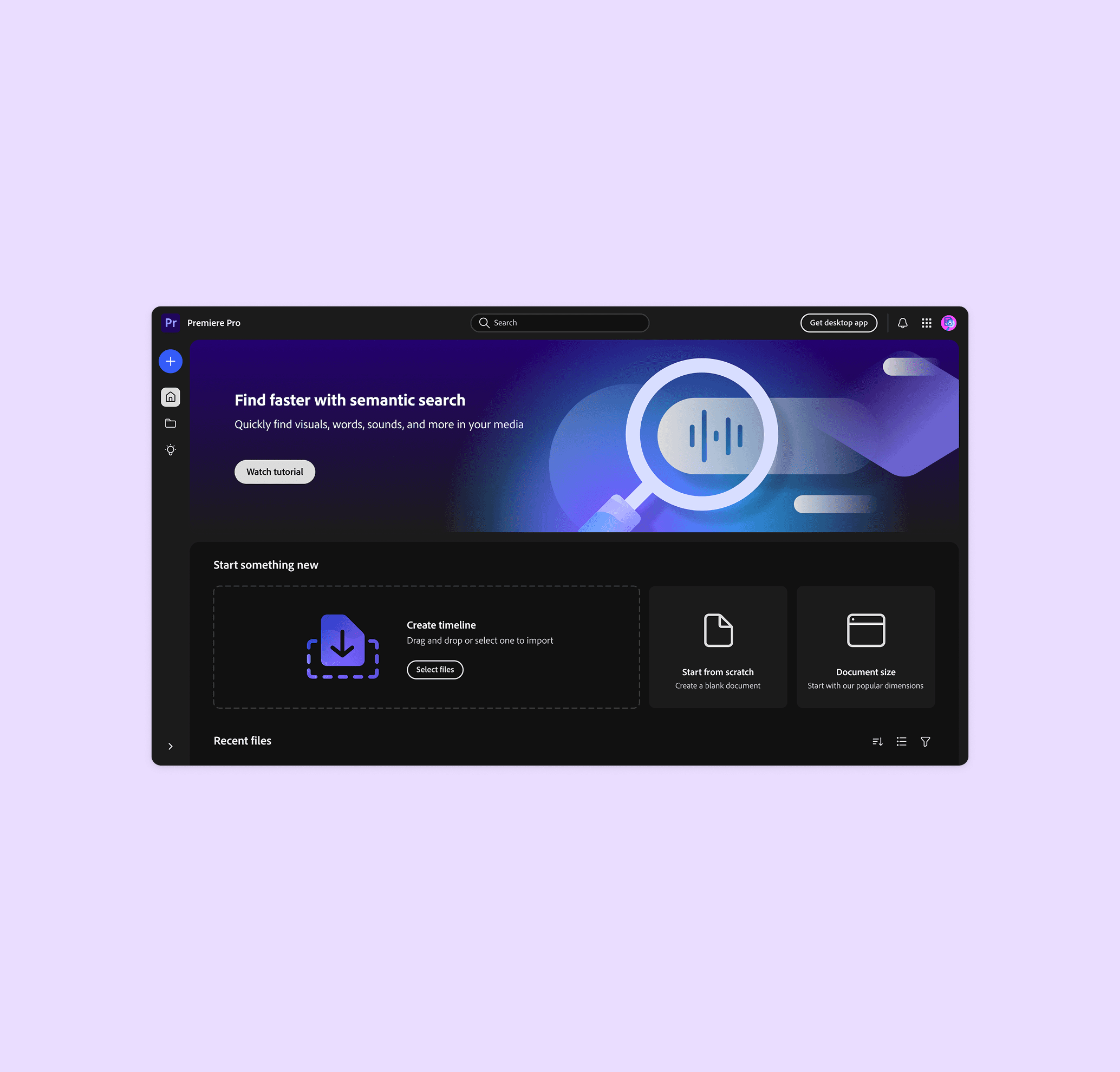
Spectrum 2 is the latest evolution of Adobe's design system, spanning all 20+ Creative Cloud, Document Cloud, and Experience Cloud products.
Role
Visual Designer on the Product Brand Team within the Spectrum Design System org. I was the primary author and illustrator of the full foundational component set, co-authored the published guidance, and ran consultations and audits for Adobe Express, GenStudio, Experience Cloud, and all net-new products. I also self-initiated a Cursor prototype to automate illustration resizing, which was later built as a Figma plugin by an engineering partner.
Problem
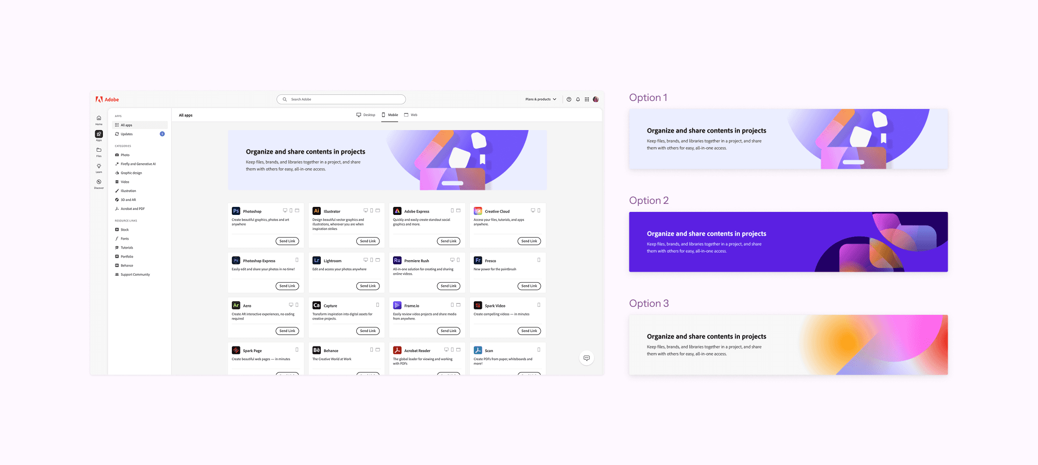
Adobe products share the Spectrum design system, but the visual language began to feel rigid and outdated. As a result, product teams were regularly breaking the system and creating their own assets. This led to an inconsistent user experience, creating friction as they navigated multiple Adobe products in their workflow. At the same time, Adobe's leadership set a company-wide strategic direction to reach younger demographics and casual creatives beyond the core Creative Professional and Business Professional audiences. The goal of the second iteration of Spectrum was to design a framework that could do both: create a cohesive, flexible system for Adobe products that also felt approachable and relevant to new and existing audiences.
Research
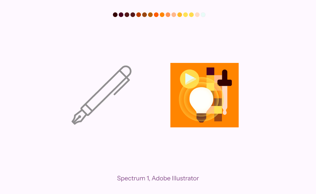
Competitive analysis on design systems informed the new visual direction. Additionally, I conducted an audit of Spectrum 1 to identify areas of inconsistency, which revealed:
216 colors were used throughout the visual system.
Process
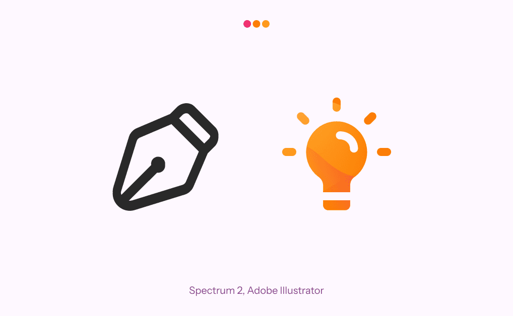
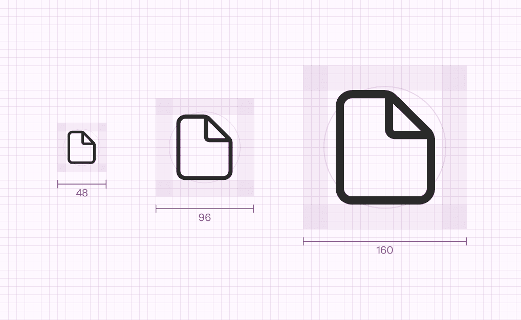
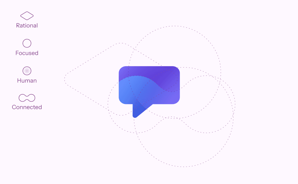
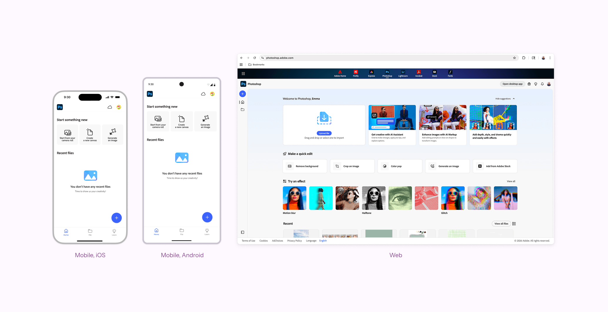
The audit and competitive analysis informed two illustration styles. Linear illustrations serve as the universal foundation across all products, using a three-size scale. I experimented with stroke weight and corner rounding until landing on the right balance. The increase in stroke weight from Spectrum 1 to Spectrum 2 was noticeable enough to read as modern and light enough to hold up at small sizes. Gradient illustrations are product-specific, with each palette derived from the product's app icon. Gradients were built from overlapping shapes that correspond directly to the four Spectrum 2 design principles: Rational, Focused, Human, and Connected. I tested and critiqued color combinations, ultimately reducing 216 colors to 10 product palettes. I authored 2,190 individual assets, published and maintained in Figma libraries and engineering repositories for web and mobile platforms.
Outcomes
Spectrum 2 launched publicly in December 2023 and was adopted across 100% of web-based and net-new Adobe products. The component libraries are used by 280 teams, with illustrations inserted in files approximately 4,500 times per week. A 2024 study found that about 40% of 18-to-24-year-olds said "Adobe is for someone like me" compared with three competitors, indicating that Adobe's brand perception improved following the system's release.
Retrospective
Spectrum 2 shaped my approach to designing and delivering assets at scale. A common instinct is to resolve inconsistency by reducing variation. However, I was able to provide thoughtful differentiation to products through the gradient approach. Serving bespoke product needs was an ongoing challenge. When faced with custom requests, I often proposed existing assets, shown in-situ along with rationale to see if it would suit the team’s needs. If not, we’d proceed with partnering on a new solution.